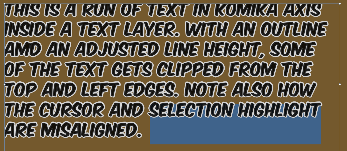
Greetings! I am a long-time Acorn owner, but only an occasional user, so I might be doing something wrong… Essentially I am having issues working with text layers that run multiple lines. Using outlines and adjusting the line height messes up the text alignment, clips some of the text, and messes up cursor and selection highlight alignment. I don’t know if this is a new issue, but it’s made things difficult to say the least. I thought it might be the font itself that was to blame, but built-in fonts like Arial Black and Apple Chancery exhibit the same problem (some do work better, to be fair). In many cases, as soon as you change the line height from auto, the top line moves upwards and gets clipped. Here is a screenshot to illustrate this (I can only post one it seems):
I see the same thing with macOS 10.14.6 (and Acorn 6.5.3). As soon as the line height is no longer “auto” the selection highlight is wrong. It seems to scale with the line height but with a too high factor. This happens with all fonts. The problem with the clipped text seems only to appear with fonts that have high ascenders (eg. Apple Chancery) and I do not see any clipping on the left side.
Yes, it’s very variable from one font to the next. The font in my example doesn’t look like it has high ascenders (it’s all-caps and pretty square-ish) but internally it’s possible. Some fonts like Courier variants seem to suffer less, but I’ve tried a bunch of different fonts and which ones are impacted (or not, and how much) is sometimes surprising. I’m not a font expert so I won’t offer theories but I can provide a list of what I observe if it’s helpful. It should be noted that apart from the OS-provided fonts, I mostly have freeware fonts or fonts from inexpensive packages, so not all of them may be of good quality in terms of the font “implementation” and that may also play a role.
Hello everyone, I’ve got this fixed for the upcoming release of 6.6, as well as in the latest builds which you can grab right here: Latest Builds from Flying Meat
Try it out, and let me know how it’s working out for you.
 but I can provide a list of what I observe if it’s helpful. It should be noted that apart from the OS-provided fonts, I mostly have freeware fonts or fonts from inexpensive packages, so not all of them may be of good quality in terms of the font “implementation” and that may also play a role.