I’m wanting to make some sketches of icons in the Lord of the Rings style, using a fountain pen and ink style. Here is an example of some text drawn that way. Any suggestions on what brush shape to use? I have a wacom tablet and perhaps that will help with pressure sensitive drawing. I’m a programmer, ha ha, just trying to make some samples for an actual artist to get my ideas conveyed. Thanks for any help!
You’ll want a flat brush with the angle set to about 45°.
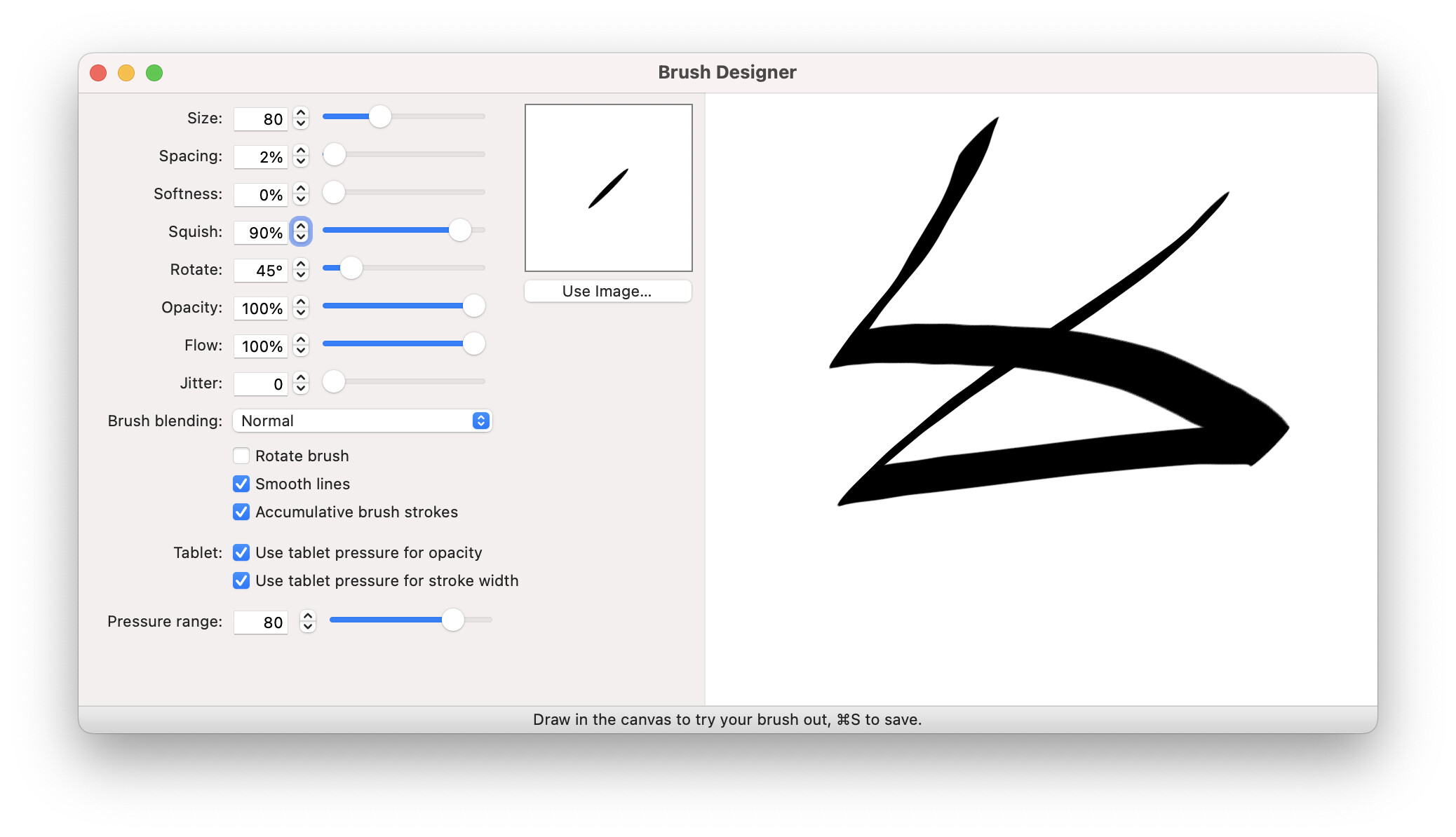
If you choose the Pen ▸ Felt brush, open up the brush designer, and then change the “squish” to 90%, you’ll get that angle and width. Here’s a screenshot of everything together:
One other thing to do is set the “Spacing” setting to as low as you can make it, and still allowing the brush to be responsive. If you have it at 1%, the brush performance might suffer but it’ll probably look better. If you have an older computer, even 4-5% might be too slow. So play around with that number on your Mac.